FOCUS
FITNESS CLUB
FOCUS FITNESS CLUB
Logo &Visual Identity
BRANDING DESIGN
Logo &Visual Identity
BRANDING DESIGN
Focus Fitness 福克斯健身|品牌logo&視覺系統
Focus Fitness 福克斯健身|品牌logo&視覺系統
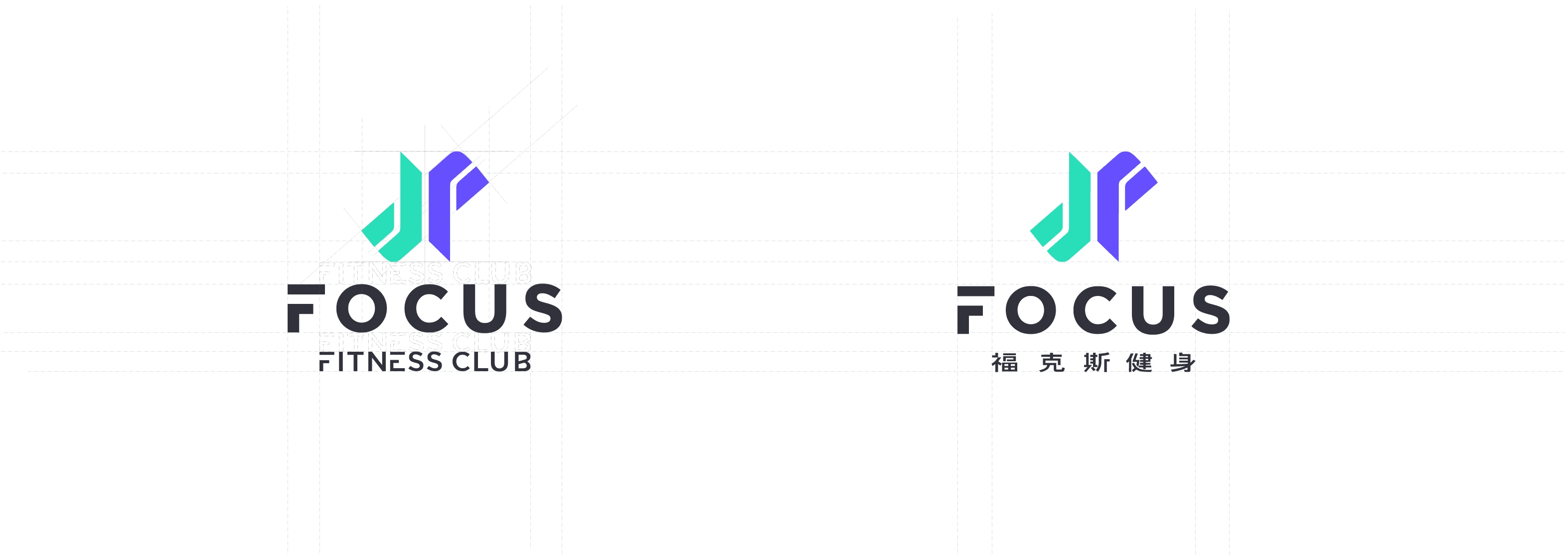
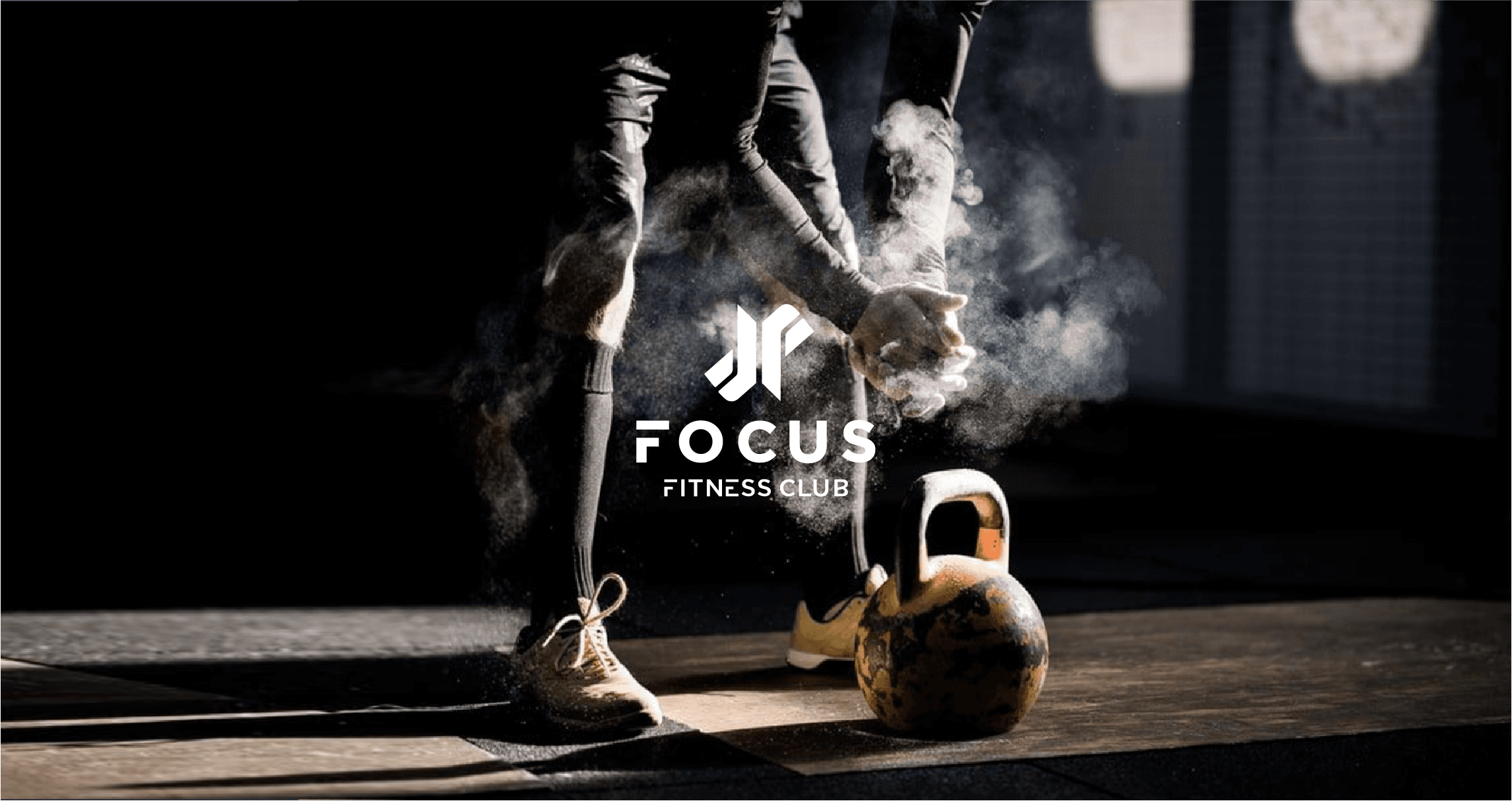
福克斯 Focus Fitness Club,作為知名健身連鎖品牌,為了吸引年輕客群並迎合運動時尚潮流,進行了品牌形象重塑。
此次重塑旨在賦予品牌更年輕、現代的視覺形象,同時保留其專業與穩健的核心價值。
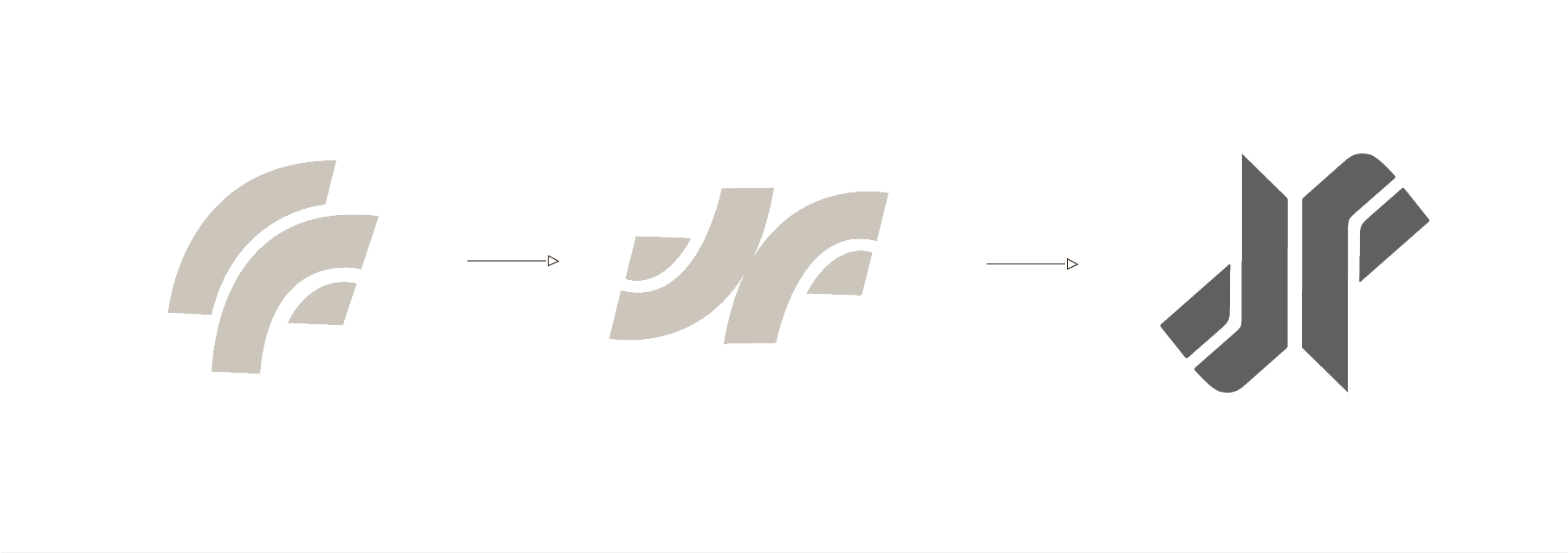
品牌Logo的創意來源於“專注”、“穩健”、“力量”及“陰陽融合”這些元素,並以品牌名稱中的雙 F 字母為基礎進行演化。透過倒置與向外結合的方式,體現品牌無限發展的概念。圖形中強烈的直線與尖角代表力量,而柔和的弧線與鈍角則帶來平衡感,詮釋品牌的剛柔並濟。
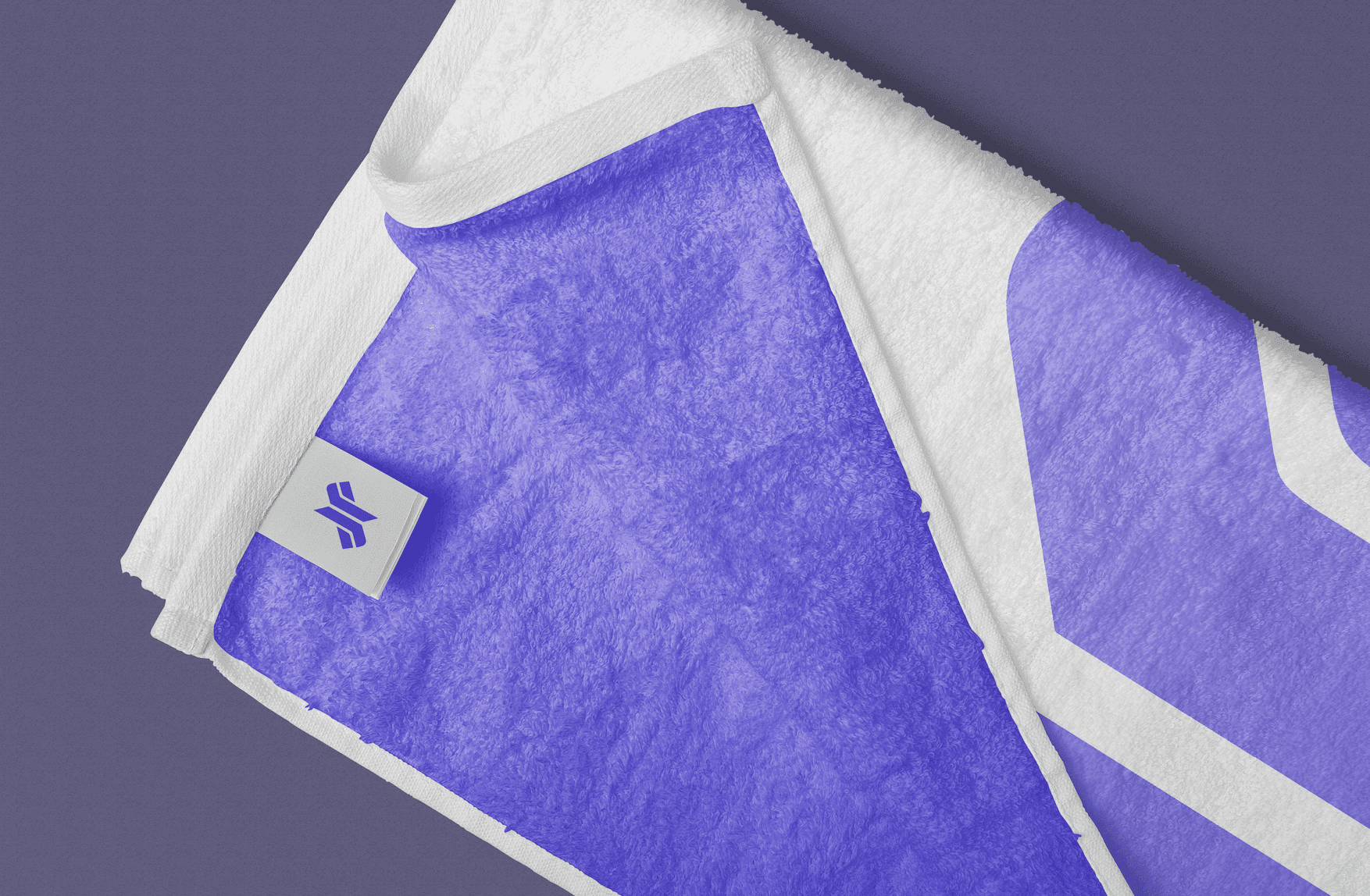
在顏色選擇上,藍紫色傳達出力量與穩定,突顯品牌的專業與動感;而湖水綠則帶來一種輕盈、放鬆的感覺,象徵著柔韌與平衡。這兩種顏色的搭配,不僅表達了品牌對各類運動項目的包容性,也傳遞了剛柔並濟、陰陽調和的全方位運動理念,完美展現了品牌的多元性與平衡之美。
Focus Fitness Club, a renowned fitness chain, has undertaken a brand image overhaul to attract a younger audience and align with current fitness and fashion trends.
The goal of this rebranding is to create a more youthful and modern visual identity while retaining the brand’s core values of professionalism and stability. The logo’s design is inspired by elements of “focus,” “stability,” “strength,” and “yin-yang harmony,” with the dual F letters from the brand name serving as the foundation for its evolution. By inverting and outwardly connecting the letters, the logo reflects the brand’s concept of limitless growth and expansion. The bold straight lines and sharp angles in the design represent strength, while the softer curves and rounded corners bring balance, embodying the brand's integration of both power and flexibility.
In terms of color, the vibrant blue-purple symbolizes strength and stability, emphasizing the brand’s professionalism and energy, while the calming teal evokes a sense of lightness and relaxation, representing flexibility and balance. This combination of colors not only reflects the brand’s inclusivity of various fitness activities but also conveys the harmonious, yin-yang philosophy of a well-rounded fitness approach, perfectly showcasing the brand’s diversity and balanced nature.
福克斯 Focus Fitness Club,作為知名健身連鎖品牌,為了吸引年輕客群並迎合運動時尚潮流,進行了品牌形象重塑。
此次重塑旨在賦予品牌更年輕、現代的視覺形象,同時保留其專業與穩健的核心價值。
品牌Logo的創意來源於“專注”、“穩健”、“力量”及“陰陽融合”這些元素,並以品牌名稱中的雙 F 字母為基礎進行演化。透過倒置與向外結合的方式,體現品牌無限發展的概念。圖形中強烈的直線與尖角代表力量,而柔和的弧線與鈍角則帶來平衡感,詮釋品牌的剛柔並濟。
在顏色選擇上,藍紫色傳達出力量與穩定,突顯品牌的專業與動感;而湖水綠則帶來一種輕盈、放鬆的感覺,象徵著柔韌與平衡。這兩種顏色的搭配,不僅表達了品牌對各類運動項目的包容性,也傳遞了剛柔並濟、陰陽調和的全方位運動理念,完美展現了品牌的多元性與平衡之美。
Focus Fitness Club, a renowned fitness chain, has undertaken a brand image overhaul to attract a younger audience and align with current fitness and fashion trends.
The goal of this rebranding is to create a more youthful and modern visual identity while retaining the brand’s core values of professionalism and stability. The logo’s design is inspired by elements of “focus,” “stability,” “strength,” and “yin-yang harmony,” with the dual F letters from the brand name serving as the foundation for its evolution. By inverting and outwardly connecting the letters, the logo reflects the brand’s concept of limitless growth and expansion. The bold straight lines and sharp angles in the design represent strength, while the softer curves and rounded corners bring balance, embodying the brand's integration of both power and flexibility.
In terms of color, the vibrant blue-purple symbolizes strength and stability, emphasizing the brand’s professionalism and energy, while the calming teal evokes a sense of lightness and relaxation, representing flexibility and balance. This combination of colors not only reflects the brand’s inclusivity of various fitness activities but also conveys the harmonious, yin-yang philosophy of a well-rounded fitness approach, perfectly showcasing the brand’s diversity and balanced nature.